Victory Update: Tooltips Are Here!
We are pleased to announce that the latest release of Victory finally includes tooltips! This feature has been in demand for a while, but nailing down an implementation strategy proved challenging. No other chart element exhibits the range of behaviors or visual possibilities as the simple tooltip.
The One True Tooltip was impossible to build because it was impossible to define. Instead, we built a set of components that could be configured and combined to create The One True Tooltip however it might look.
Tooltip Demonstration

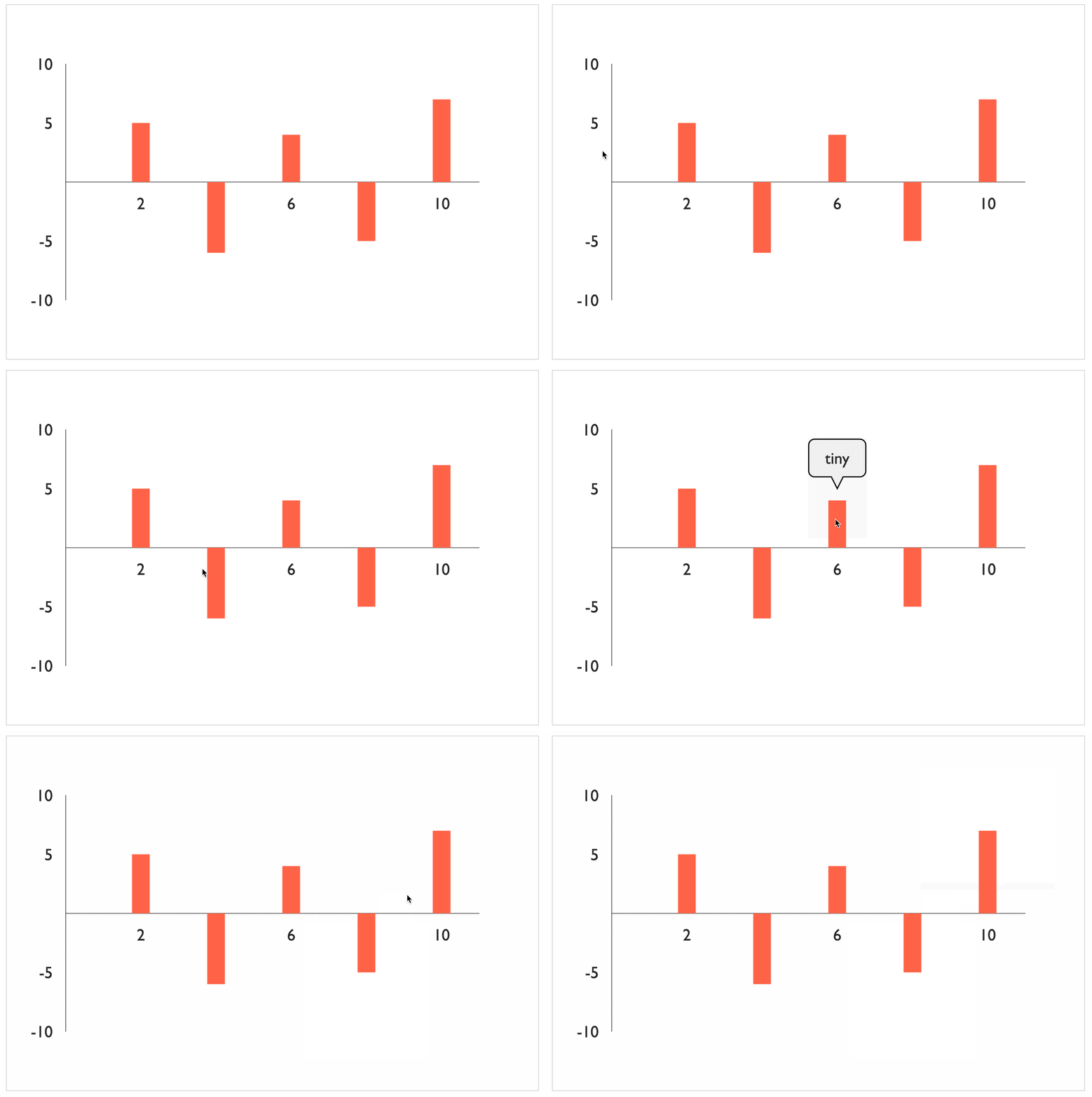
<VictoryScatter
  data={[
    { x: 2, y: 5, label: "right-side-up" },
    { x: 4, y: -6, label: "upside-down" },
    { x: 6, y: 4, label: "tiny" },
    { x: 8, y: -5, label: "or a little \n BIGGER" },
    { x: 10, y: 7, label: "automatically" },
  ]}
  style={{ data: { width: 15, fill: "tomato" } }}
/>
The easiest way to add a tooltip to a chart is to replace the default label component with a tooltip like labelComponent={}. Any Victory component that uses labels will pass in the appropriate text to your tooltip component. By default, tooltips are automatically sized to accommodate label text and oriented correctly for each data point. onMouseOver and onMouseOut event handlers are also automatically registered for each data point.
Customizing VictoryTooltip
Default behaviors are incredibly convenient until they get in the way. VictoryTooltip is written to be configurable, extendable, and replaceable. Users can alter props directly on the component like labelComponent={}. Custom tooltip containers can be created by replacing the default flyoutComponent with a custom path or any other svg element. Event handlers can even be replaced by extending VictoryTooltip and overriding its static defaultEvents array.
Flyout Component
By default, VictoryTooltip uses a component called Flyout to render the tooltip container. Flyout renders a path element that is calculated based on x, y, width, height, orientation, cornerRadius, pointerLength, and pointerWidth. Because the path is calculated rather than scaled or transformed from a hard-coded path, a wide variety of container shapes is possible with minor configuration.

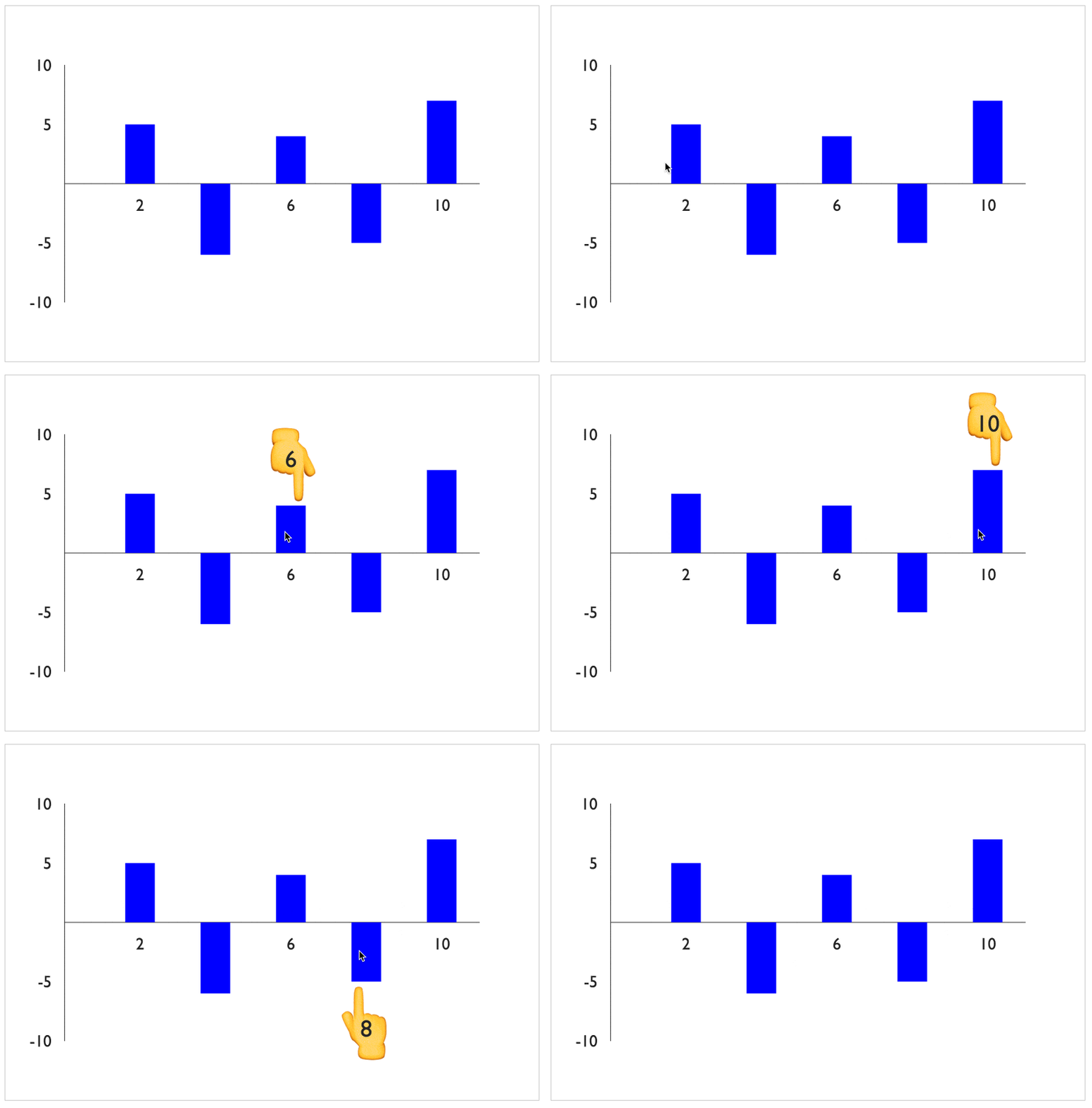
If something completely custom is required, a completely custom component can be supplied to VictoryTooltip. Here’s an example of an extremely silly custom tooltip.

The custom HandPointer component renders emoji hands rather than a path element.
class HandPointer extends React.Component {
  static propTypes = {
    x: React.PropTypes.number,
    y: React.PropTypes.number,
    orientation: React.PropTypes.string,
  };

  render() {
    const size = 70;
    const pointer = this.props.orientation === "top" ? "👆" : "👇";
    const offset = this.props.orientation === "top" ? -5 : 55;
    const x = this.props.x - size / 2;
    const y = this.props.y + offset;

    return (
      <text x={x} y={y} fontSize={size}>
        {pointer}
      </text>
    );
  }
}
Once written, the custom component is supplied to VictoryTooltip like <VictoryScatter labelComponent={<HandPointer />} /> and is usable just like any other tooltip.
VictoryVoronoiTooltip
We wrote VictoryVoronoiTooltip to improve the behavior of tooltips on components that are not easy to interact with, like line components or very small scatter points. VictoryVoronoiTooltip has more in common with full data components like VictoryBar than it does with simple label components, as it renders both data and labels.
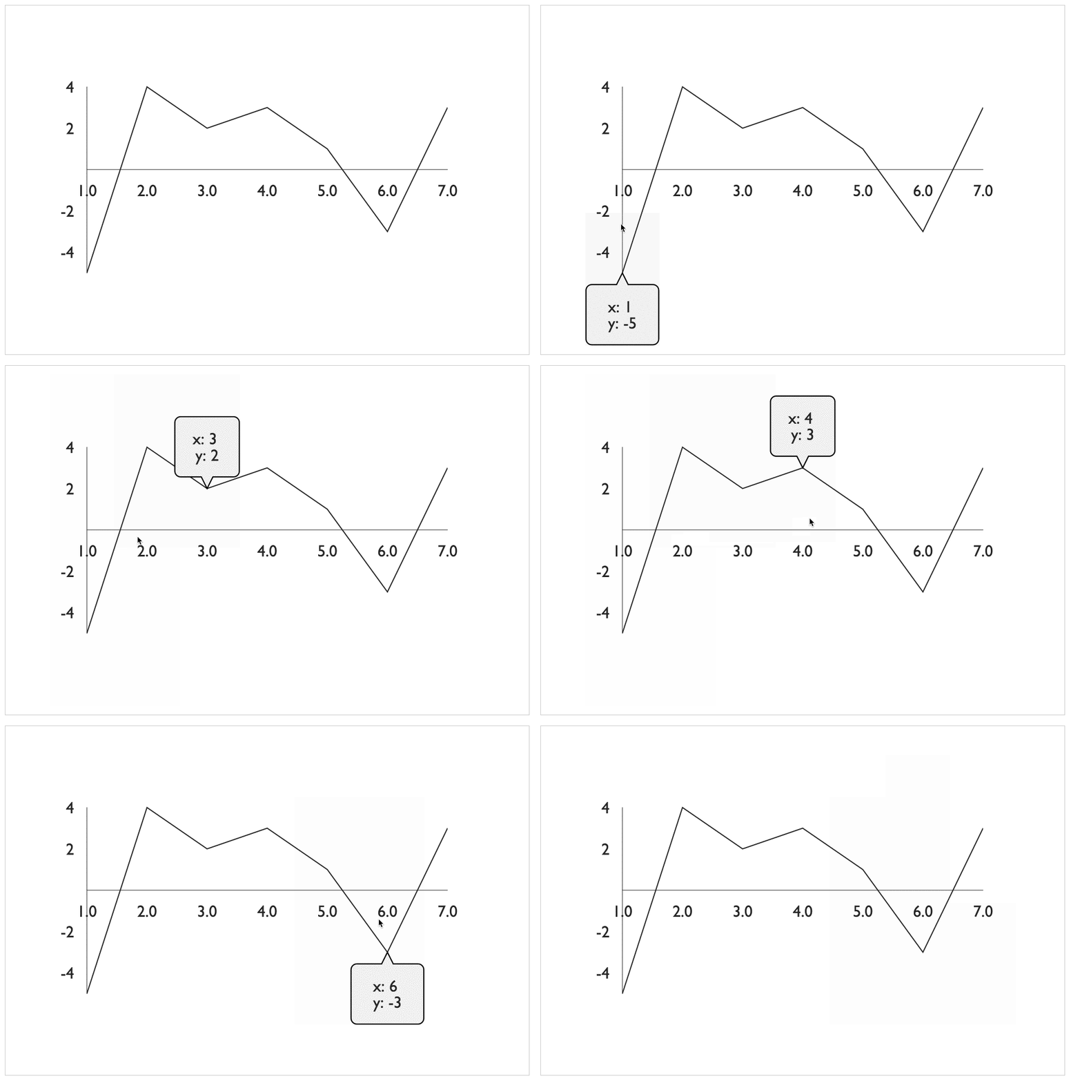
The data rendered by VictoryVoronoiTooltip is a transparent Voronoi diagram, with each polygon corresponding to a closest data point. This creates a much larger interactive area for each data point, resulting in more fluid tooltip interactions.

To add a Voronoi tooltip to a chart, simply provide it with data and labels like so:
<VictoryVoronoiTooltip
  labels={({ datum }) => `x: ${datum.x} \n y: ${datum.y}`}
  data={[
    { x: 1, y: -5 },
    { x: 2, y: 4 },
    { x: 3, y: 2 },
    { x: 4, y: 3 },
    { x: 5, y: 1 },
    { x: 6, y: -3 },
    { x: 7, y: 3 },
  ]}
/>
We decided it was a little tedious to supply the same data to each component, so we made an enhancement to the VictoryGroup wrapper component so that it can supply data to all its children. The equivalent example using VictoryGroup looks like this:
<VictoryGroup data={[
  { x: 1, y: -5 },
  { x: 2, y: 4 },
  { x: 3, y: 2 },
  { x: 4, y: 3 },
  { x: 5, y: 1 },
  { x: 6, y: -3 },
  { x: 7, y: 3 },
]}>
  <VictoryVoronoiTooltip
    labels={({ datum }) => `x: ${datum.x} \n y: ${datum.y}`}
  />
</VictoryGroup>
Much cleaner!
Customizing VictoryVoronoiTooltip
VictoryVoronoiTooltip is an instance of the VictoryVoronoi component that uses VictoryTooltip as a default labelComponent. Because of this modular assembly, any customizations that are possible for VictoryTooltip are easily applied to VictoryVoronoiTooltip by simply replacing components.
To specify props such as cornerRadius and pointerLength from VictoryVoronoiTooltip, add them directly to the label component labelComponent like so:
<VictoryVoronoiTooltip
  labelComponent={<VictoryTooltip cornerRadius={5} pointerLength={10} />}
/>
Supporting Features
Supporting tooltips was the main goal of this release, but the work required to complete this feature resulted in a few cool features and enhancements.
VictoryVoronoi Component
VictoryVoronoi is exposed as its own component rather than being an intrinsic part of VictoryVoronoiTooltip. Read more about this component in our docs.
Enhanced VictoryGroup Wrapper
The enhancements made to VictoryGroup are convenient for sharing data and styles between child components, but they also make it possible to stack components as a set. Read more about when to use VictoryGroup here.
Arbitrary Component Events with defaultEvents
VictoryTooltip attaches events to whatever component uses it by exposing a static defaultEvents array. Now any component that is included by another as a dataComponent, labelComponent, etc., can register defaultEvents and target elements in the component including it. For example, the default events supplied by VictoryTooltip look like this:
static defaultEvents = [{
  target: "data",
  eventHandlers: {
    onMouseOver: () => ({
      target: "labels",
      mutation: () => ({ active: true }),
    }),
    onMouseOut: () => ({
      target: "labels",
      mutation: () => ({ active: false }),
    }),
  },
}];
All Rendered Components Exported from VictoryCore
To make Victory more flexible and easier to extend, we’ve exported all small, rendered components (e.g., Point, Bar, Flyout, etc.). We hope this change will make Victory even more fun to use!

