An Approach to New Figma Features
Figma is a fantastic tool, but even as a well-versed user, it can be challenging to up-to-date with new features, especially when you're immersed in client work. I like to use a method where I allocate time, be it small or big, to experiment with new features.
Doing so enables me to:
- Grasp the fundamentals.
- Tinker and learn the limits of where they may be useful.
- Apply them in new client work or projects.
Two things I’m passionate about: Figma and Pickup Basketball
Lately, I've been delving into conditional prototyping and variables. If there's one thing I cherish as much as design, it's playing basketball. I decided to embark on a small project that would not only help my learning but also allow me to apply it to something I'm passionate about.
I set out to design a Figma prototype for a pick-up basketball game that I could have at my fingertips. While many front-end experts could effortlessly code this, there's something fun about designing and crafting a straightforward prototype with basic logic—without ending up with a spaghetti noodle prototype mountain.
Getting the concept down
So, the initial step was to establish the foundational logic of my objectives, saving the feature goals for a subsequent phase. I find it beneficial to specify the types of variables I'll be using in advance. I chose blue colors for number values and red for string values, knowing I could add more as needed.
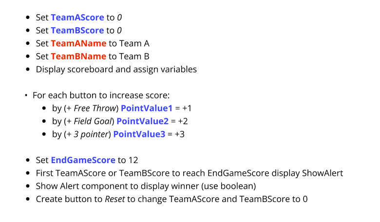
Having established this logic, it was time to begin integrating Figma’s new Variables! My first move was to input string and numbers values corresponding to team data.
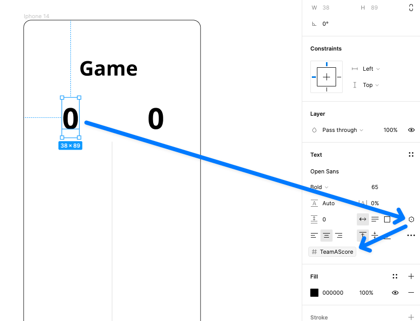
Next, I began mapping those variables to data elements within the interface. This approach is compatible with both string and numeric, which I plan to utilize later.
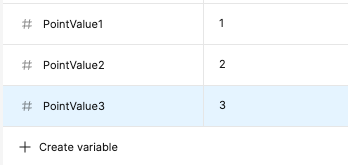
I proceeded to define values for the points. Although this adds an additional layer of data, I thought it could be valuable. Should I ever desire to modify point values for a distinct sport or a different basketball type of play like the game of "21" (typically scored with 2s and 1s instead of 2s and 3s), this setup simplifies the process.
I created some standard buttons, applying the same methodology I used earlier for the team scores.
Let's transition to conditional prototyping. Before Figma rolled out this functionality, every incremental number would have needed a separate frame and text box to prototype between. Now, we can seamlessly add logic into the prototype. Using the first button as an example for the initial interaction. I've incorporated a new interaction on tap, adjusting the variable logic to TeamAScore to TeamAScore + 1.
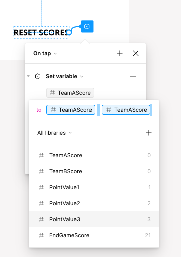
I wanted to make sure I incorporated a reset button to start new game, people always want to run games back. So, I added a "reset" label to the display and integrated straightforward logic. Essentially, I subtracted the existing score from itself to revert to 0. Thankfully, you can assign multiple 'Set Variable' actions to a link, so I duplicated this for Team B too.
Now for some added delight and fun, because we can’t leave out boolean variables. Booleans can essentially have control of something being true or false which adds a lot of possibilities when combined with conditional prototyping. So lets add in a point spread for either team, if the A or B team is up more than 15 points, we show an icon (a flame icon) indication.
So there’s some more logic needed here; if (#teamAScore ≥ #TeamBScore + Spread amount) or if (#teamBScore ≥ #TeamAScore + Spread amount), then set the indication component to true. I then created an extra component for the flame True/False states here and the spread distance, incase that needs to be changed later. Lastly I’m using “Touch Down” for the interaction to check the entire frame for this to be true or false upon each click.
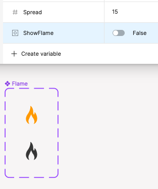
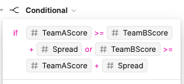
That gives us a nice little indication when a team is up by the spread or in other words….a blow out.
One of the huge benefits here is this is all done with a couple components, and a single frame on the canvas.
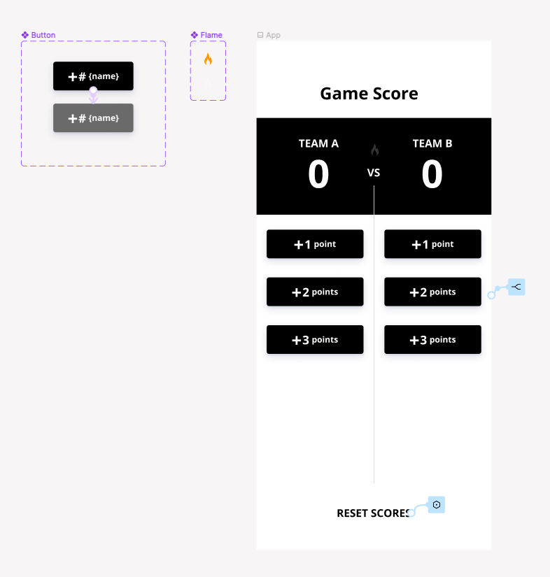
Let's see all of it in action, working inside of Figma. And of course, with color theming (using color variables and modes — but that's a topic for another time), it's easy to enhance the design.
Of course, there are some drawbacks, such as the need to make the logic visible to others; it can be somewhat obscured within the interface. Additionally, there's the initial mindset shift required when transitioning from traditional prototyping (which still has its place) to using variables and conditional prototyping.
However, this is just a glimpse of what these new Figma features can achieve. In fact, I plan to continually integrate more features and ideas into this app design, further building upon them and enhancing my learning. Stay tuned for more Figma and Basketball.
